
Rethinking the Toggle: Why Your Website’s Dark Mode Switcher Is Overcomplicated (And How to Fix It)

Executive Overview
In the modern digital landscape, few interface conventions are as ubiquitous as the dark mode toggle. Whether tucked neatly into a navigation bar, floating in a corner, or buried within a settings dropdown, the sun-and-moon icon has become a staple of web design. For years, standard implementation has gravitated toward a three-state control paradigm: Light, Dark, and System.
While this tripartite approach appears comprehensive on paper, emerging UI/UX theory suggests it is a classic example of over-engineering. In a recent, deeply analytical critique, prominent web developer and standards advocate Lea Verou argued that the traditional three-state dark mode toggle introduces unnecessary cognitive overhead. By forcing users to manually parse three distinct choices—especially when two of those choices often overlap—designers inadvertently clutter their interfaces with redundant controls.
This article examines Verou’s thesis, breaking down the mechanics of the "good two-state control," analyzing the psychological friction of persistent UI elements, and evaluating when—if ever—a tri-state switch remains justified. As the web development community continuously seeks ways to streamline user experiences and reduce cognitive dissonance, the humble dark mode toggle is receiving a much-needed, radical reappraisal.
Detailed Chronology: The Evolution of Theme Switching and the Rise of the Three-State UI
The Dawn of Manual Toggles
In the early days of widespread web styling, dark modes were virtually non-existent outside of niche developer forums or specialized applications. When the trend truly exploded in the late 2010s—propelled by major operating system overhauls from Apple, Google, and Microsoft—developers scrambled to accommodate visitor preferences.
Initially, websites relied on simple, binary binary switches. A click of a button flipped a boolean value, transitioning a site from a white background to a dark charcoal palette. These early iterations saved the user’s preference using browser storage (localStorage), ensuring that returning visitors were greeted with their preferred visual environment.
The Introduction of "System" Awareness
As operating systems integrated native dark modes tied to time-of-day automation or user preferences, the web standard evolved. The introduction of CSS media queries—specifically prefers-color-scheme—allowed websites to dynamically inherit the user’s OS-level settings without requiring manual intervention.
This technological leap created a design dilemma. If a website automatically adapts to the system theme, where does that leave the user who wants to manually force a specific mode regardless of their OS settings? The web design community’s answer was the tri-state toggle:
- Light Mode (Force light styling)
- Dark Mode (Force dark styling)
- System Mode (Inherit OS-level preference)
While functional, this approach effectively shifted the burden of managing state directly onto the end user, transforming what should have been a seamless, background experience into an active administrative task.
The Counter-Revolution: Verou’s 2026 Thesis
In her foundational breakdown of modern dark mode toggles, Lea Verou challenged the status quo. By analyzing real-world usage scenarios, Verou demonstrated that a well-designed two-state control is entirely capable of managing light, dark, and system preferences without explicitly spelling out all three options to the user. This intervention has sparked a broader industry conversation about minimalist UI design, prompting developers to reconsider how much control needs to be overtly exposed versus quietly automated.
Supporting Context & Metrics: The Cognitive Cost of UI Clutter
To understand why a two-state control is superior, one must first examine the psychological toll of unnecessary interface elements.
The Psychology of Choice and Cognitive Dissonance
Every interactive element placed on a webpage demands a fraction of the visitor’s cognitive bandwidth. When a user lands on a content-driven website, their primary intent—whether reading an article, purchasing a product, or researching a topic—should occupy 100% of their focus.
Persistent UI elements, such as navigation headers containing social links, search bars, and theme toggles, create visual noise. When a theme toggle presents three distinct options, the user’s brain must execute a micro-decision: “Am I on system, should I be on dark, does this match my current environment, and what happens if my operating system changes later?”
This micro-decision introduces cognitive dissonance. As Verou notes, the theme toggle is entirely tangential to the user’s actual goal. By reducing the UI footprint of this control, developers can minimize distractions and keep the user immersed in the core content.
Mechanics of the Two-State Paradigm
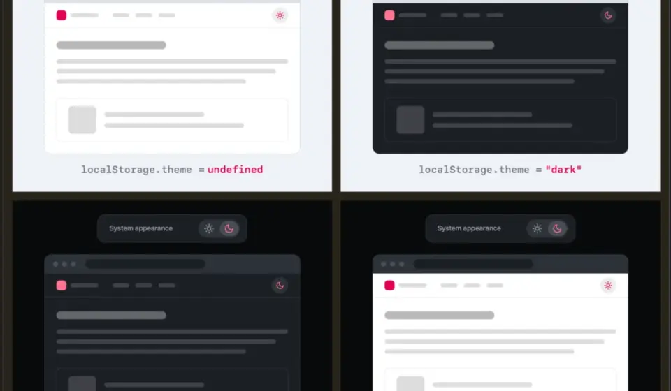
The core of Verou’s argument rests on a streamlined user flow:
- Default State (No Preference): The website gracefully falls back to the visitor’s system settings via CSS (
prefers-color-scheme). No explicit override is active. - The Override: If the user desires a specific mode that contradicts their current system setting, they interact with a simple two-state control (e.g., toggling from light to dark).
- Persistence: That preference is captured and stored locally (via
localStorage), overriding the system default for subsequent sessions.
[Visitor Arrives]
       │
       ├─► No Local Override? ──► Inherit System Setting (`prefers-color-scheme`)
       │
       └─► Local Override Exists? ──► Apply Stored Preference (`localStorage`)
Crucially, Verou points out that users only need to apply an override the first time it becomes relevant—specifically, when the system setting and the user’s immediate preference diverge. For instance, if a user has their OS set to light mode during the day, but prefers reading dark-mode sites in low-light environments, they click the toggle once. From that point forward, the system manages the state seamlessly through persistent memory.
The Edge Case: Toggling Back and Reverting
A common counter-argument raised by developers concerns the lifecycle of a toggle when a user cycles backward. If a visitor starts with a light system preference, manually overrides it to dark, and later decides to switch back to light, what happens to the underlying state?
Does the system generate a new override preference, or does it clear the localStorage value to revert cleanly back to the system setting?
According to UI analysts, this technical nuance largely matters very little in practice. Because theme switching is secondary to the user’s primary intent, minor discrepancies in state reversion are rarely noticed. If the operating system eventually shifts to dark mode and the user realizes their manual override is still pinned to light, fixing it requires a single, effortless click. An interface should not overcomplicate its baseline design to prevent a scenario that is mathematically rare and practically trivial to resolve.
Official Perspectives & Community Discourse
The discussion surrounding Verou’s proposals has generated robust debate across frontend developer communities, CSS-Tricks forums, and UX design circles.
The Argument for Context-Aware Minimalism
Proponents of the two-state model argue that the industry has spent years blindly copying mobile operating system patterns onto the web, where they often fail to fit naturally. Mobile OS settings panels require explicit three-state controls because users are configuring a global device environment. A website, however, is a transient destination.
As one prominent UX contributor noted in the community discourse:
"If the browser or operating system already provides a robust system-level preference mechanism, why duplicate that cognitive load inside every single webpage wrapper? Build the preference detection into the code, but spare the user from seeing a bloated override menu unless it is genuinely required."
When is a Tri-State Control Actually Appropriate?
While Verou champions the two-state approach as the default, she acknowledges that exceptions exist. A tri-state control is not inherently flawed; rather, it is frequently misapplied. According to her analysis, three states are justifiable in exactly two primary scenarios:
- Complex Software Applications: Interfaces like IDEs, design tools (Figma, Photoshop), or heavy dashboards where users frequently toggle themes based on granular lighting conditions or specific project requirements, and where "System" matching needs to be explicitly confirmed or denied within an in-app preferences menu.
- High-Stakes Accessibility Environments: Sites where users with specific visual impairments or photosensitivities need absolute, unambiguous control over their rendering environment to prevent ocular strain, requiring instant visibility into whether the app is overriding their device settings.
For standard content sites, blogs, and marketing pages, however, these conditions do not apply. Forcing a tri-state toggle onto a standard reading interface is the UI equivalent of placing a manual transmission shifter in an autonomous electric vehicle—functional, but unnecessarily demanding of the user.
Future Outlook: The Next Generation of Web UI Design
As web standards mature, the relationship between user intent, browser capabilities, and interface design continues to tighten. The ongoing shift away from bloated tri-state toggles toward intelligent, minimalist two-state controls signals a broader maturation in frontend engineering.
1. The Rise of "Invisible" Infrastructure
The future of web accessibility and personalization lies in ambient computing—systems that adapt intelligently to the user without demanding explicit configuration. By relying more heavily on robust CSS media queries and silent local storage handling, developers can create sites that feel naturally attuned to the user’s needs without cluttering the navigation bar.
2. Standardization of Minimalist Design Patterns
As influential developers like Lea Verou continue to audit common UX anti-patterns, design systems (such as Tailwind UI, Bootstrap, and material design frameworks) are likely to reevaluate their default component templates. We can expect future component libraries to default to streamlined, two-state theme switches, relegating complex multi-state preference panels strictly to application-level settings pages.
3. Prioritizing Cognitive Economy
Ultimately, the debate over dark mode toggles is a microcosm of a larger design philosophy: respecting the user’s attention. In an attention economy saturated with visual noise, pop-ups, banners, and persistent widgets, every pixel stripped away from a navigation bar is a victory for clarity. By embracing the elegance of the two-state control, developers can deliver cleaner, faster, and more intuitive digital experiences that get out of the user’s way and let the content shine.
What do you feel about this post?

Like

Love

Happy

Haha

Sad

Angry