

Executive Overview
In the realm of digital user interface (UI) and user experience (UX) design, few elements are as ubiquitous—or as frequently misused—as the humble dropdown list. Also known as a select menu, this collapsible input control has been a staple of web and mobile forms since the early days of graphical user interfaces. Designers naturally gravitate toward dropdowns because they offer a seductive combination of compact visual footprint, high flexibility, and straightforward implementation. They promise an uncluttered layout, neatly packing dozens—or even hundreds—of options behind a single, unassuming click.
However, this design convenience comes at a steep cost to the end user. By hiding available options behind an interactive wall, dropdowns introduce unnecessary friction into everyday digital tasks, slow down decision-making, and create persistent accessibility barriers. Far from being a neutral design choice, the dropdown list is a high-cost pattern that trades interface cleanliness for user effort.

Recent industry research and usability studies reveal that while dropdowns enjoy widespread popularity, they are frequently deployed in scenarios where alternative controls—such as radio buttons, comboboxes, or simple text inputs—would perform significantly better. To build truly intuitive, accessible, and efficient digital products, modern product teams must move past treating the dropdown as a default form element. Instead, they must recognize it as a specialized tool justified only within a narrow set of specific, highly constrained contexts.
Detailed Chronology: The Evolution and Pitfalls of the Select Menu
To understand why dropdown lists have become both a design crutch and a usability hazard, it is helpful to examine how their implementation has evolved alongside the web.
The Early Web and the Need for Conservation
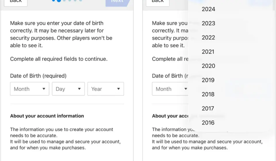
In the formative years of web design, screen real estate was exceptionally precious. Monitors were small, resolutions were low, and loading extensive UI elements could degrade performance. The HTML <select> element was introduced as a native browser control to solve a fundamental layout challenge: how to present a large discrete set of options without overwhelming the page.
In this environment, hiding options inside a collapsible menu was an engineering necessity. Developers and designers embraced the pattern because it kept long lists—such as state selections or birth years—contained within a predictable, uniform box.
The Shift Toward Customization and Friction
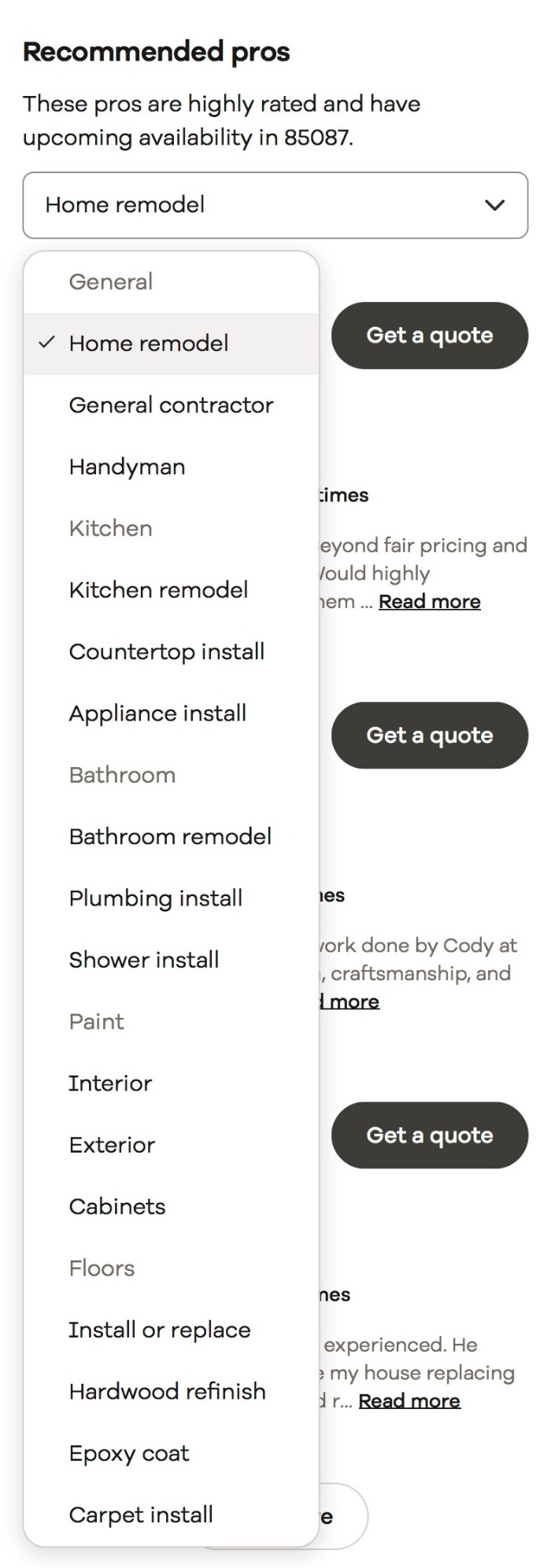
As web standards advanced and brands sought deeper control over their digital aesthetic, native browser dropdowns were increasingly replaced by custom-coded UI components. While this allowed designers to match color palettes, typography, and spacing guidelines, it inadvertently introduced a new category of usability failures.
Unlike native menus, which leverage underlying operating system efficiencies, custom dropdowns frequently break standard browser behaviors. For instance, users scrolling through a long custom dropdown often accidentally click outside the bounding box, instantly closing the menu and resetting their progress. This friction transformed a simple data-entry task into a frustrating micro-game of precision navigation.
Furthermore, the rise of mobile computing exacerbated these physical challenges. On touchscreens, long scrolling dropdown lists became prime candidates for "fat-finger" errors, accidental dismissals, and exhausting vertical sweeps, proving that a pattern born of desktop constraints was poorly adapted to the mobile era.
Supporting Context & Metrics: The Hidden Costs of Dropdowns
When evaluating form performance, design teams often measure success by backend data cleanliness rather than frontend user effort. This misalignment masks the true toll that dropdown lists inflict on the user experience.

Low Discoverability and Progressive Disclosure
Dropdown lists rely on a design principle known as progressive disclosure: hiding complexity until the user explicitly requests it. While this effectively reduces initial visual noise, it severely harms discoverability.
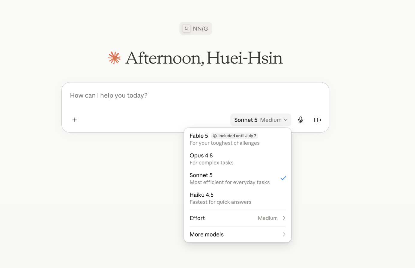
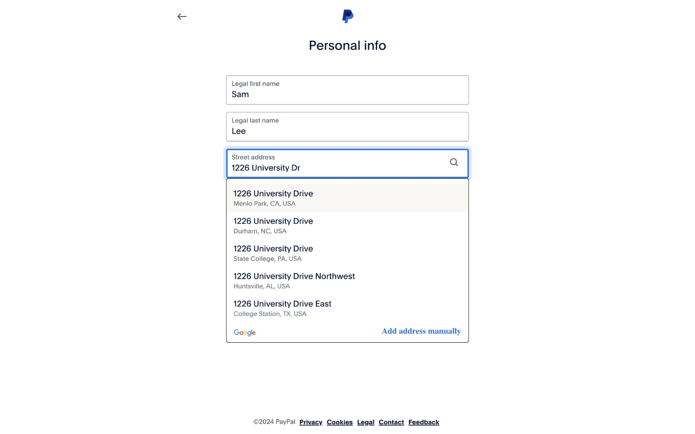
In a long, multi-field form, a compact dropdown is easily overlooked or mistaken for an already-completed field. Consequently, the pre-selected default value carries immense weight. Research indicates that many users will accept the default option without ever interacting with the control to explore alternatives—a phenomenon frequently observed in AI tools and software configuration menus where users stick with baseline settings simply because the alternatives are hidden from view.
The Multi-Step Interaction Cost
Interacting with a standard dropdown list requires a cumbersome sequence of cognitive and physical actions:
- Locate the control within the visual hierarchy.
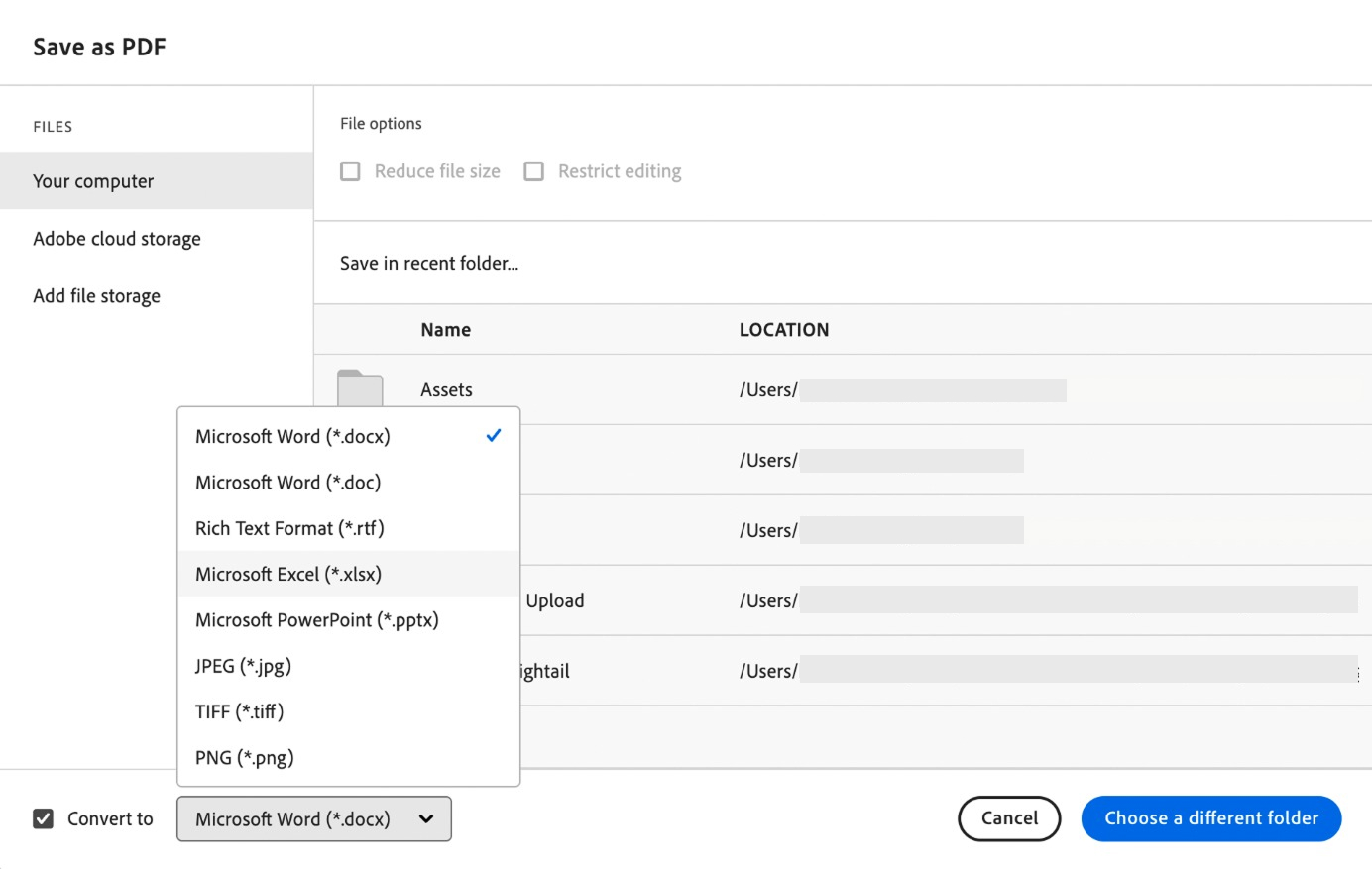
- Click or tap to open the menu and reveal the hidden options.
- Scan the newly exposed list for the desired value.
- Select the target option while maintaining motor control.
When compared to radio buttons—which expose all choices immediately and require only a single click—the interaction cost of a dropdown is exponentially higher. For menus containing dozens of options, such as international country lists, users must visually parse a wall of text without the benefit of upfront information scent.

Accessibility Barriers
Accessibility audits, notably extensive research conducted by GOV.UK, have consistently documented severe usability roadblocks associated with dropdown lists, particularly for keyboard-only and motor-impaired users. Common failure points include:
- Difficulty navigating options using standard arrow keys.
- Screen readers failing to accurately announce dynamic state changes.
- Custom dropdowns completely ignoring browser zoom settings.
Because of these persistent barriers, public-facing digital services are increasingly advised to treat dropdown lists as a mechanism of absolute last resort.
The Illusion of Clean Data
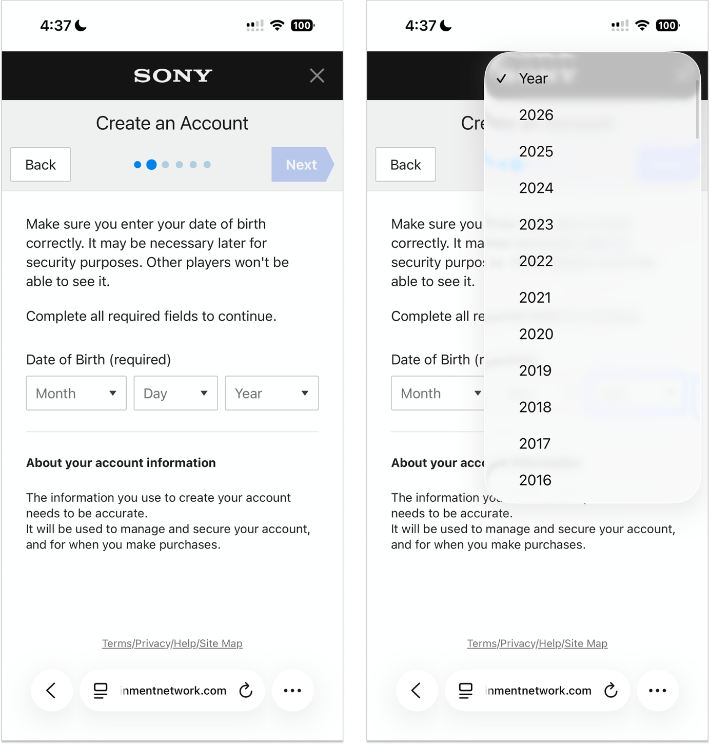
Backend developers often advocate for dropdowns because they constrain user input, ensuring that databases receive standardized, machine-readable values. However, input constraint only works when the provided options align perfectly with the user’s mental model.
When a user looks for their nationality or industry classification, they arrive with a context shaped by personal identity, culture, and daily language. If their expected term (e.g., "UK" versus "United Kingdom") is absent, or if the list relies on rigid, internal taxonomies, users are forced to choose an inaccurate substitute just to proceed. The resulting backend data may look pristine and free of typos, but it achieves that cleanliness only by compromising data validity.
Official Industry Standards and Guidelines
As UI/UX design has matured into an evidence-based discipline, major design systems have established quantitative thresholds and qualitative guidelines regarding when—and when not—to use dropdown lists.
The Threshold of Few Options
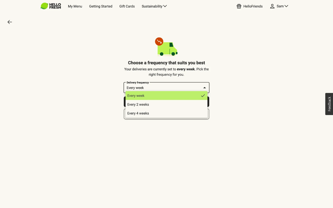
When a form field contains only a handful of choices, collapsing them behind a click adds unnecessary friction. Major design frameworks have codified specific minimum thresholds where dropdowns should be discarded in favor of exposed controls like radio buttons:
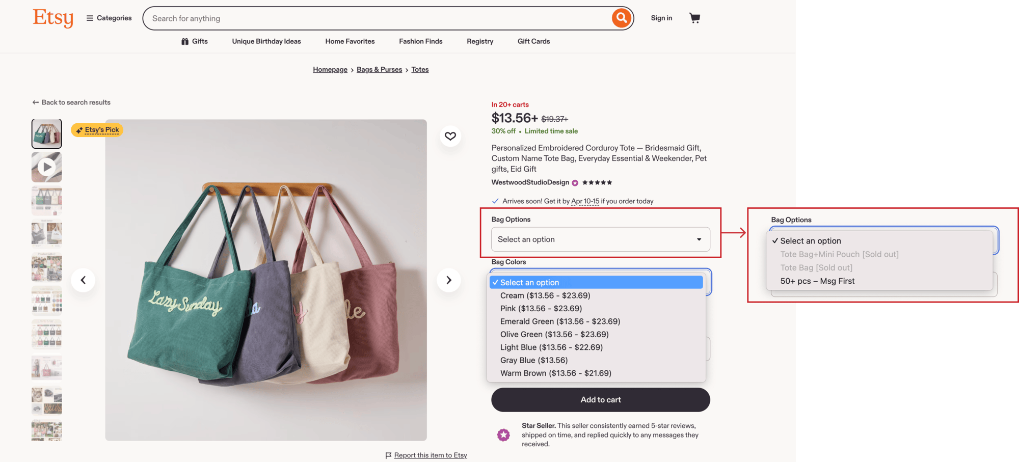
- IBM Carbon Design System: Draws the line at 3 items.
- Google Material Design (M3): Sets the threshold at 6 items.
- U.S. Web Design System (USWDS): Recommends radio buttons for fewer than 7 items.
When options can comfortably fit on screen, exposing them directly via radio buttons saves users the cognitive effort of guessing what lies behind a closed menu.
The Combobox Alternative for Long Lists
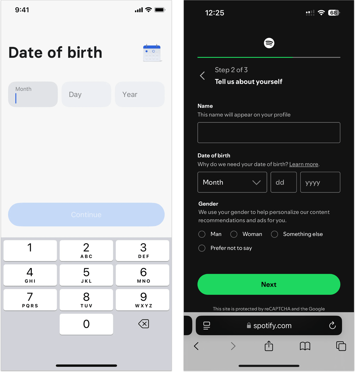
Conversely, when a list exceeds roughly 15 options (such as geographic regions or university names), standard dropdowns become unwieldy. In these instances, industry consensus points toward the combobox—a hybrid text input paired with a filterable dropdown list. By allowing users to type directly to narrow down results, the combobox eliminates the need to manually scroll through hundreds of irrelevant entries.
Future Outlook: Moving Beyond the Dropdown
As digital interfaces continue to evolve toward greater personalization, predictive AI integration, and cross-platform fluidity, the traditional dropdown list will likely see its domain shrink further.
Future-forward product teams are already adopting smarter design patterns that bypass selection menus entirely:
- Smart Defaults and Geolocation: Automatically populating fields like country, currency, or timezone based on device settings, removing the need for manual selection.
- Natural Language Inputs: Utilizing flexible text fields with intelligent autocomplete rather than forcing users to conform to rigid drop-down taxonomies.
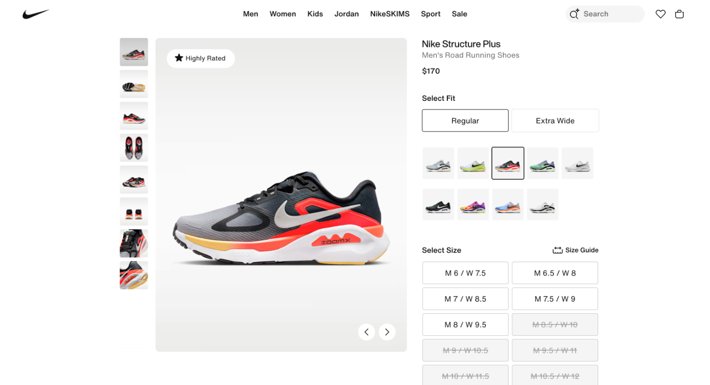
- Visual Swatches and Inline Buttons: Presenting product variants, sizes, and colors as interactive buttons that expose real-time inventory and availability at a glance.
Conclusion
The dropdown list is not inherently evil, but it is deeply overused. Before incorporating a select menu into your next form design, pause to evaluate the core metrics: How many options are truly available? Do users need to see them to make a confident choice? Does the layout genuinely benefit from hiding them?
By treating dropdown lists as a high-cost tradeoff rather than a universal default, designers can build forms that respect user time, reduce cognitive load, and deliver truly seamless digital experiences.