
Mastering Depth in Web Design: A Comprehensive Investigation into the CSS translateZ() Function

Executive Overview
For decades, the standard paradigm of web design has been fundamentally tethered to two dimensions. From the earliest days of HTML layouts to modern CSS grid systems, digital experiences have relied heavily on the X and Y axes—height and width—rendered flat across desktop monitors, tablets, and mobile screens. However, the maturation of modern browser rendering engines and the formalization of specifications like the CSS Transform Module Level 2 have profoundly altered this landscape. Today, front-end engineers possess the tools to construct authentic three-dimensional spatial environments directly within the browser viewport.
At the core of this spatial revolution lies the CSS translateZ() function. Defined officially within the World Wide Web Consortium (W3C) standards, translateZ() allows developers to shift elements along the Z-axis, pulling them closer to the user or pushing them further away into virtual depth. While it is frequently mistaken for a simple scaling utility or a generic layout trick, translateZ() is a sophisticated projection-based transformation that alters how elements interact with camera perspectives. When paired with proper property declarations such as perspective, transform-style: preserve-3d, and hardware-accelerated rendering pipelines, this function unlocks entirely new dimensions of user interface design.
This deep-dive investigation explores the mechanics, syntax, underlying mathematics, real-world utility, and performance-optimizing superpowers of the translateZ() function. Whether you are building immersive 3D card flips, multi-layered parallax scrolling interfaces, or simply hunting for a reliable GPU-acceleration hack to eliminate animation stutter, understanding the nuances of the Z-axis is an indispensable skill for the modern web developer.
Detailed Chronology & Evolution of 3D CSS Transforms
To fully appreciate the significance of translateZ(), one must trace the historical trajectory of how browsers handle spatial calculations. In the early eras of web development, layout engines were entirely planar. Elements occupied a flat document flow, and any semblance of depth required rasterized images, complex drop shadows, or faux-isometric raster assets.
The Dawn of 2D Transforms
The introduction of CSS3 transformed web animation by introducing the transform property. Initially, functions like translate(), rotate(), and scale() were confined strictly to the 2D plane (X and Y axes). Developers could slide elements horizontally or vertically, spin them around a central 2-dimensional point, or stretch them along flat coordinates. While revolutionary for its time, this era of web design lacked any concept of an interactive camera, focal lengths, or actual depth perspective. Elements grew larger via scale(1.5) simply by multiplying their pixel dimensions, completely ignoring spatial physics.
Entering the Third Dimension: CSS Transforms Level 1 & 2
As hardware capabilities evolved—driven largely by the proliferation of dedicated Graphics Processing Units (GPUs) in consumer devices—the CSS Working Group recognized the necessity for native 3D rendering. The CSS Transforms specification introduced 3D counterparts to traditional transform functions, including translate3d(), rotateX(), rotateY(), and the foundational translateZ().
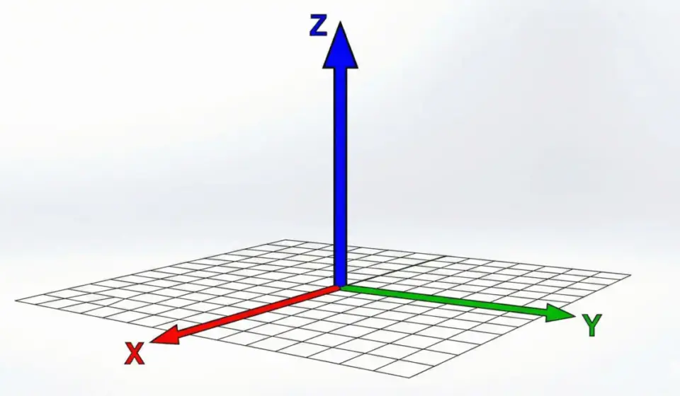
Defined formally within the CSS Transform Module Level 2, these specifications established a standardized Cartesian coordinate system for the web:
- X-Axis: Runs horizontally (left to right).
- Y-Axis: Runs vertically (top to bottom).
- Z-Axis: Runs perpendicularly through the screen (from the background into the user’s face).
The introduction of translateZ() specifically gave developers granular control over the Z-plane. However, early adoption was plagued by confusion. Developers quickly realized that applying translateZ() to an element in isolation yielded no visible result. Because browsers flattened rendering contexts by default, moving an element along an invisible axis without a defined camera perspective resulted in a mathematical transformation that produced zero visual output. This friction catalyzed a deeper community-wide understanding of projection theory, focal lengths, and container-level perspective stacking contexts.
Technical Architecture & Mechanics: How translateZ() Works
To master translateZ(), one must first understand the fundamental illusion of web-based 3D graphics. Computer screens are inherently flat (2D canvases). Therefore, rendering a 3D object requires a mathematical projection—a process of translating three-dimensional coordinates $(X, Y, Z)$ into two-dimensional screen coordinates $(X’, Y’)$.
The Syntax and Argument Structure
The translateZ() function accepts a single <length> argument, which dictates the magnitude of the displacement along the Z-axis.

/* Syntax Definition */
translateZ() = translateZ(<length>)

/* Positive lengths pull the element closer to the viewer */
.element-near
  transform: translateZ(100px);
  transform: translateZ(5rem);


/* Negative lengths push the element further away into the background */
.element-far
  transform: translateZ(-50px);
  transform: translateZ(-8em);
When a positive length is supplied (e.g., translateZ(100px)), the element is shifted 100 pixels toward the virtual viewer (the camera). Conversely, a negative length pushes the element away from the viewer.
The Crucial Prerequisites: Perspective and Transform-Style
By default, web browsers do not render depth. If you apply a translateZ(100px) transformation to a standard <div>, nothing appears to change visually. Two conditions must be met for translateZ() to take effect:
- A Perspective Context: The browser must know the distance between the viewer and the screen plane. This is established using either the
perspectiveproperty on a parent container or theperspective()function directly inside the transform stack. - A 3D Rendering Context: By default, parent containers flatten their children into a 2D plane. To maintain spatial depth across nested hierarchies, developers must apply
transform-style: preserve-3dto the parent element.
Consider the following production-ready structural setup:
<div class="scene">
  <div class="parent">
    <div class="box">translateZ(100px)</div>
  </div>
</div>
/* Step 1: Establish the viewing window */
.scene
perspective: 800px;
/* Step 2: Ensure child elements exist in a true 3D space rather than being flattened */
.parent
transform-style: preserve-3d;
/* Step 3: Apply the Z-axis translation */
.box
transform: translateZ(100px);
Perspective vs. Scale: Debunking the Size Myth
A common point of confusion among engineers encountering 3D transforms for the first time is distinguishing between translateZ() and scale().
When an element is hovered with the rule .box:hover transform: translateZ(100px); , it appears to grow larger on the screen. It is tempting to assume that translateZ() is simply a fancy alternative to scale(). However, this is an optical illusion governed by the rules of perspective projection.
When an object moves closer to your eyes in physical reality, it occupies a larger visual angle in your field of view, making it appear bigger. The actual dimensions (width and height) of the .box element remain completely unchanged. If you rotate the parent container along the Y-axis to view the scene from a profile angle, it becomes immediately apparent that the element has physically traveled forward along the Z-axis, rather than expanding its bounding box boundaries.
perspective Property vs. perspective() Function
Understanding how to define perspective in CSS is vital, as syntax errors here will render translateZ() completely inert. There are two primary mechanisms for introducing perspective into a stylesheet: the container-level perspective property and the inline perspective() transformation function.
1. The perspective Property
Applied to a parent or ancestor container, the perspective property defines the distance between the user and the z=0 plane. All child elements within that container share the same vanishing point and projection matrix.
.parent-container
  perspective: 800px; /* Sets the viewing distance for all children */


.child-one
  transform: translateZ(200px); /* Calculated relative to 800px perspective */


.child-two
  transform: translate3d(100px, 200px, 150px); /* Shares the same perspective environment */
2. The perspective() Function
Alternatively, perspective can be applied directly to an individual element as part of its transform string. However, order matters immensely when using the function-based approach.
/* INCORRECT: perspective() placed after translateZ() will fail to work properly */
.element-fail
  transform: translateZ(100px) perspective(800px);


/* CORRECT: perspective() must be declared FIRST in the transform stack */
.element-success
  transform: perspective(800px) translateZ(100px);
When stacking multiple transformation functions, the browser reads them from left to right. Because the projection matrix established by perspective() must be calculated before an object can be positioned in 3D space, the perspective function must precede translateZ().

Performance Optimization & The GPU Acceleration Hack
Beyond its aesthetic applications in spatial design and immersive user interfaces, translateZ() holds a legendary status in the front-end engineering community for an entirely different reason: performance optimization.
CPU vs. GPU Rendering Pipelines
Historically, web browsers relied heavily on the Central Processing Unit (CPU) to calculate layout geometry, repaint pixels, and handle DOM updates. When complex animations or heavy DOM manipulation occurred, the CPU could easily become a bottleneck, leading to dropped frames, janky scrolling, and noticeable visual stutter.
Modern browsers, however, feature highly optimized Graphics Processing Units (GPUs) designed specifically for parallel matrix math, rasterization, and rapid pixel composition.
The translateZ(0) Hack
By applying a 3D transform function like translateZ(0) or translate3d(0,0,0) to an element, developers instruct the browser to promote that element onto its own dedicated rendering layer (often referred to as creating a "compositing layer" or activating "hardware acceleration").
.high-performance-element
  /* Forces the browser to hand rendering duties over to the GPU */
  transform: translateZ(0);
When an element is promoted to a GPU layer:
- Elimination of Layout Thrashing: The element is painted once and cached as a texture on the GPU. Subsequent animations (such as opacity shifts or CSS transitions) do not trigger expensive browser layout reflows or repaints.
- Silky Smooth Animations: Transitions execute at hardware refresh rates (60Hz, 120Hz, or higher), completely eliminating micro-stutters.
- Memory Trade-off: While powerful, overuse of layer promotion can consume excessive VRAM (video memory) on mobile devices, making it a technique best applied selectively to animated UI components, sticky headers, and modal overlays.
Future Outlook & Emerging Standards in Web Spatial Design
As the web transitions from flat 2D interfaces toward immersive spatial computing, augmented reality (AR), virtual reality (VR), and spatial web applications (such as experiences optimized for Apple Vision Pro and WebXR frameworks), the role of CSS 3D transforms will expand exponentially.
The Convergence of CSS and Spatial Computing
The foundational mechanics established by translateZ() and the CSS Transform Module Level 2 are laying the groundwork for how human-computer interaction will operate in three-dimensional browser environments. As CSS specifications mature into Level 3 and beyond, we can anticipate deeper integrations between standard DOM nodes and WebGL/WebGPU contexts.
Future iterations of layout engines will likely streamline depth-sorting, introduce native lighting and shadow casting models driven by CSS variables, and provide deeper programmatic hooks for tracking user gaze and hand gestures along the Z-axis. Mastering functions like translateZ() today is no longer just a clever trick for building slick UI cards; it is foundational preparation for the next generation of spatial web engineering.
Summary Reference Table
| Feature | Description |
|---|---|
| Function Syntax | translateZ(<length>) |
| Primary Purpose | Shifts an element along the Z-axis (depth perspective) |
| Required Context | Parent container must have perspective defined and transform-style: preserve-3d |
| Positive Values | Pulls the element closer to the viewer (appears larger) |
| Negative Values | Pushes the element further into the background (appears smaller) |
| Performance Trick | translateZ(0) forces GPU layer promotion, eliminating animation jank |
| Specification | CSS Transform Module Level 2 |