
Rethinking the B2B SaaS Comparison Page: Why Integrity is the Ultimate Conversion Lever

In the modern enterprise software landscape, the traditional playbook for SaaS comparison pages is broken. For over a decade, marketing teams have relied on a predictable, highly orchestrated formula: stack a feature matrix heavily in favor of your own product, list a litany of supposed shortcomings about your competitors, and pepper the page with aggressive calls-to-action (CTAs) engineered to force a hasty transaction.
Today’s B2B buyers, however, are far too informed, skeptical, and risk-averse to fall for biased, one-to-one matchup pages. In an economic climate characterized by tight budgets and intense financial scrutiny, software purchasing decisions carry immense professional risk. When a modern buyer champions a new tool internally, their personal credibility is on the line. If a comparison page feels engineered solely to win an argument rather than illuminate reality, it is immediately dismissed.
According to landing page expert Tas Bober, the strongest SaaS comparison pages do not pressure buyers into a snap decision. Instead, they act as objective guides designed to help the right buyers evaluate their true options, determining whether a specific solution genuinely fits their team, budget, workflow, and strategic priorities.
Executive Overview
The evolution of search intent, the rise of AI-driven answer engines, and shifting consumer behavior have fundamentally altered how B2B software is researched and bought. Modern comparison pages are no longer mere checkpoints on an SEO checklist; they are critical foundational assets in the buyer journey.
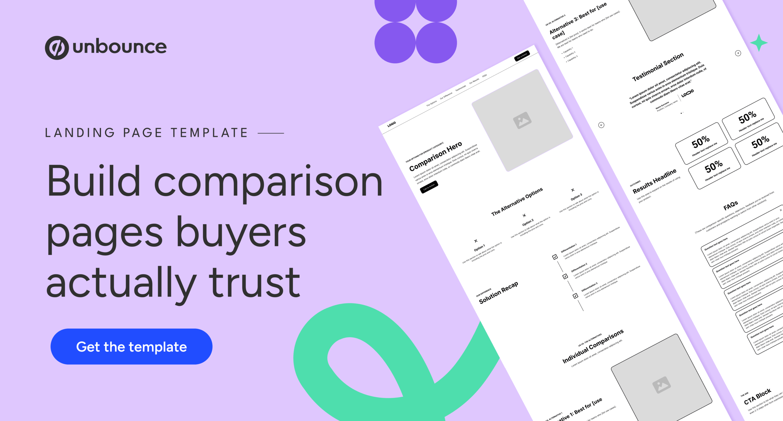
Research indicates that between 40% and 60% of potential B2B deals are lost not to competitors, but to customer indecision—meaning buyers often default to manual workarounds, legacy spreadsheets, or doing nothing at all. Consequently, top-performing SaaS companies are pivoting away from aggressive competitor takedowns. They are embracing transparent, nuanced, and structurally robust comparison frameworks that prioritize buyer fit, outline genuine trade-offs, and establish radical trust.

Detailed Chronology & Industry Evolution
To understand how SaaS comparison pages reached this critical juncture, it is helpful to look at how marketing strategies have transformed alongside search technology:
- The Keyword-Stuffing Era (Early 2010s): Comparison pages emerged primarily as SEO tactics. Companies built thin, text-heavy "vs." pages designed purely to capture high-volume search terms, often offering little substantive value to the reader.
- The Biased Matrix Era (Mid-to-Late 2010s): Marketers recognized the commercial intent behind comparison queries and introduced feature tables. These tables were almost universally skewed, utilizing checkmarks and X-marks to paint competitors in a poor light while exaggerating proprietary capabilities.
- The Skeptical Buyer Era (2020–2024): As software markets saturated and buyers grew more sophisticated, conversion rates on heavily biased pages plummeted. Buyers began relying on peer reviews (e.g., G2, Capterra) and community forums (e.g., Reddit) to bypass corporate marketing entirely.
- The Transparent Guidance Era (Present): Today, search engines, large language models (LLMs), and hyper-informed buyers penalize lack of depth and obvious bias. Modern comparison pages must function as objective resource hubs that help users navigate complex category landscapes, weigh manual alternatives, and address genuine migration hurdles.
Supporting Context & Metrics: The Anatomy of Modern Evaluation
Building a high-performing comparison page requires a structural framework rooted in user psychology rather than outbound sales messaging. Industry experts emphasize several core categories and strategic frameworks that define the modern landscape.
The Core Types of Comparison Pages
Different stages of the buyer journey demand distinct comparison formats:
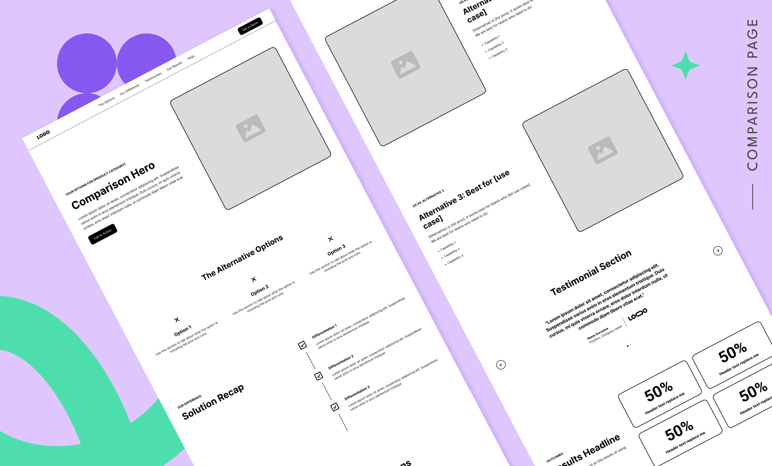
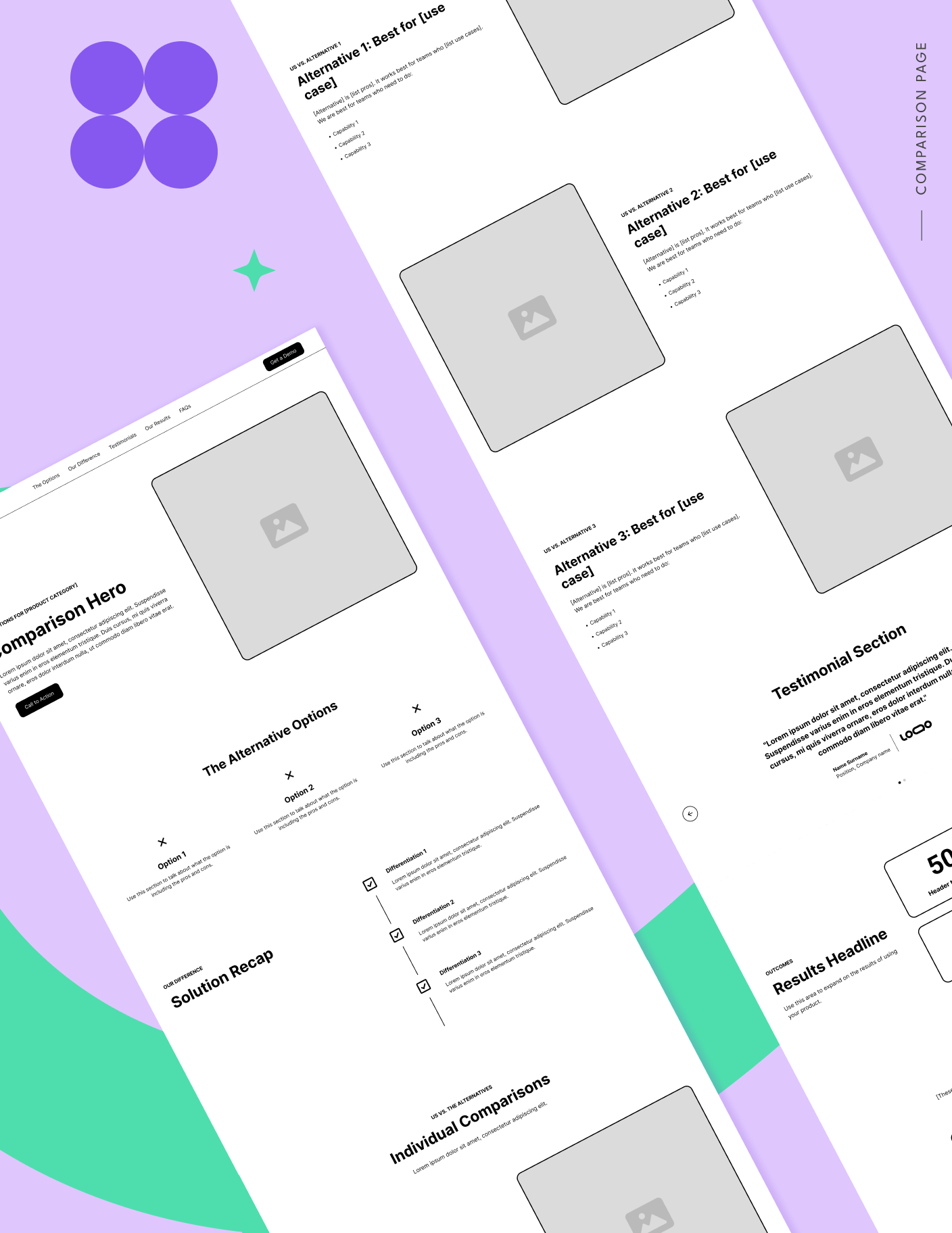
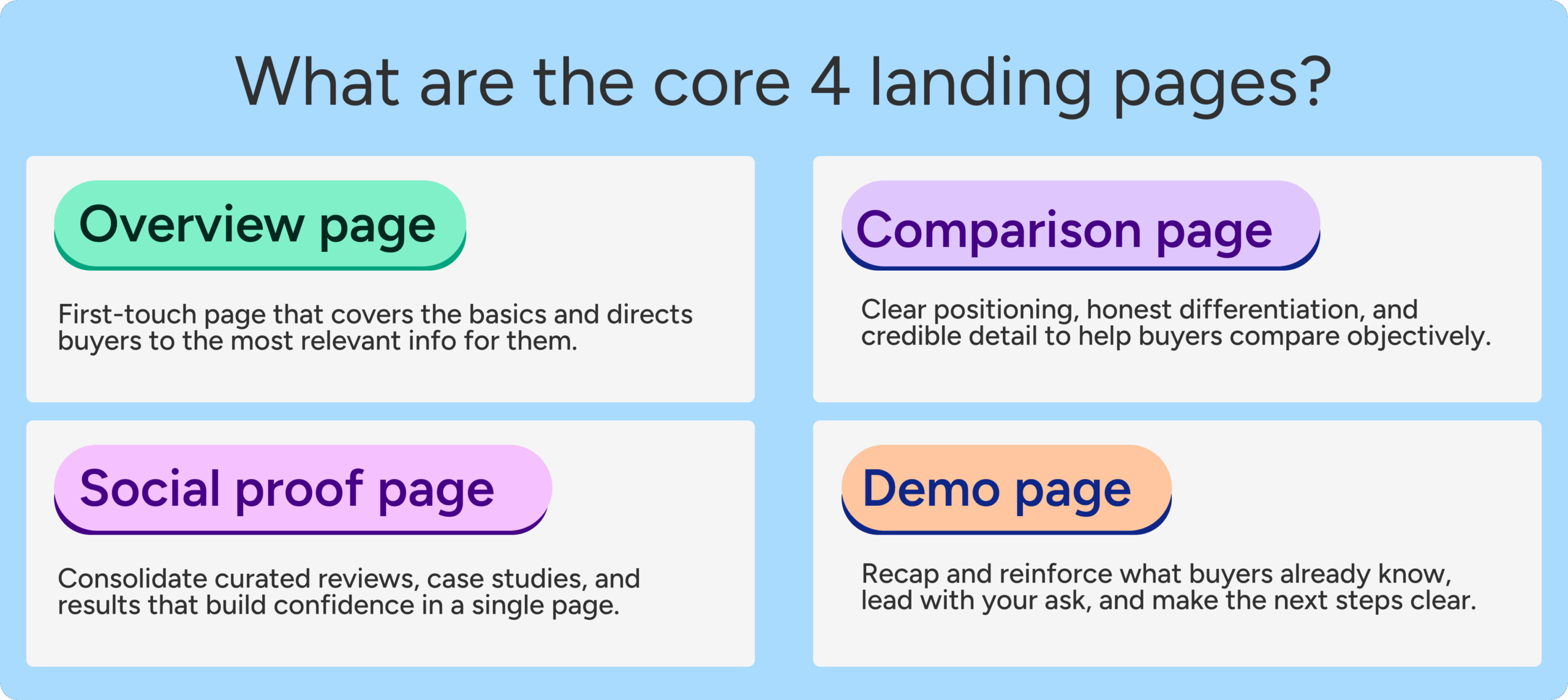
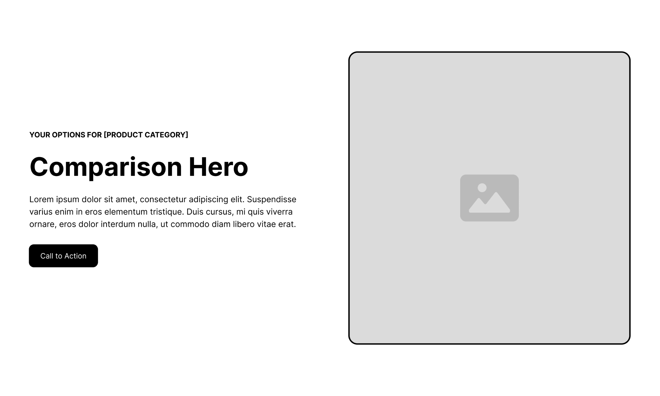
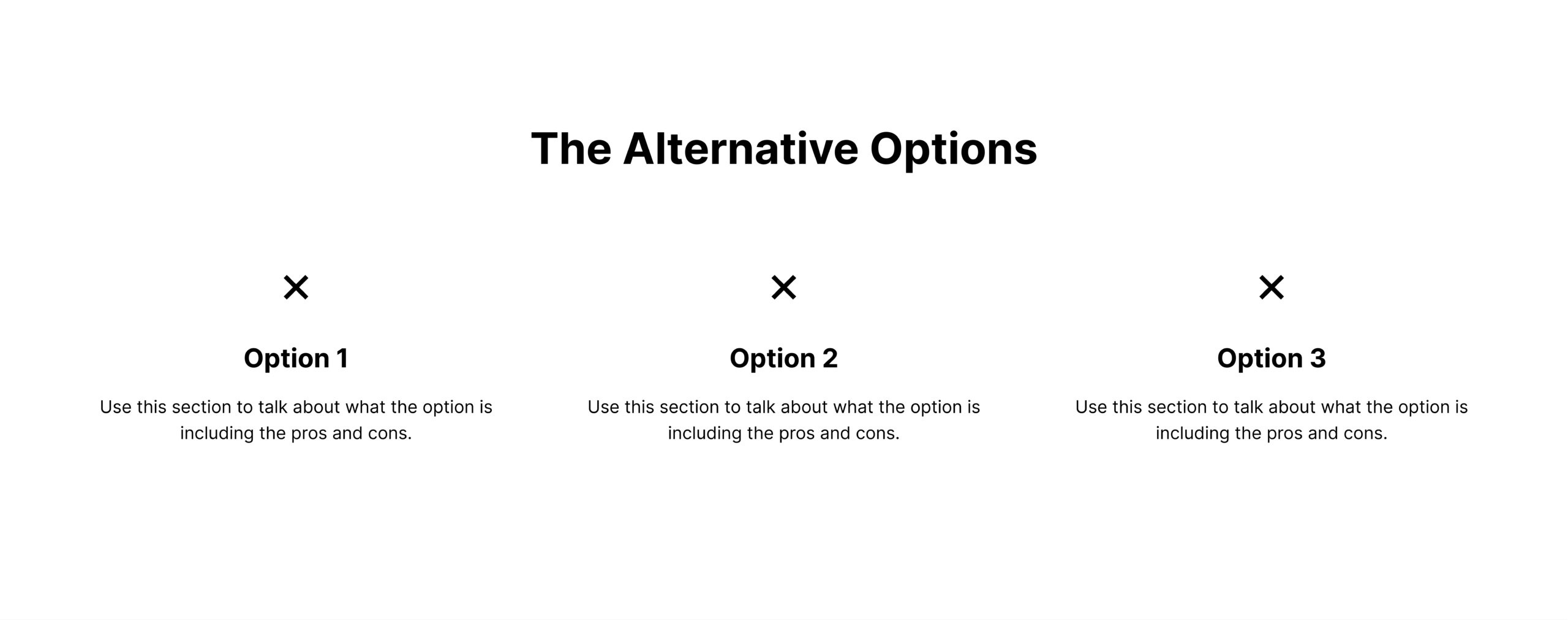
- Comparison Overview Pages: Designed to answer the broad question, "What are my options for solving this problem?" These pages tackle the reality that your biggest competitor is often customer inertia or internal workarounds rather than a direct rival software vendor.
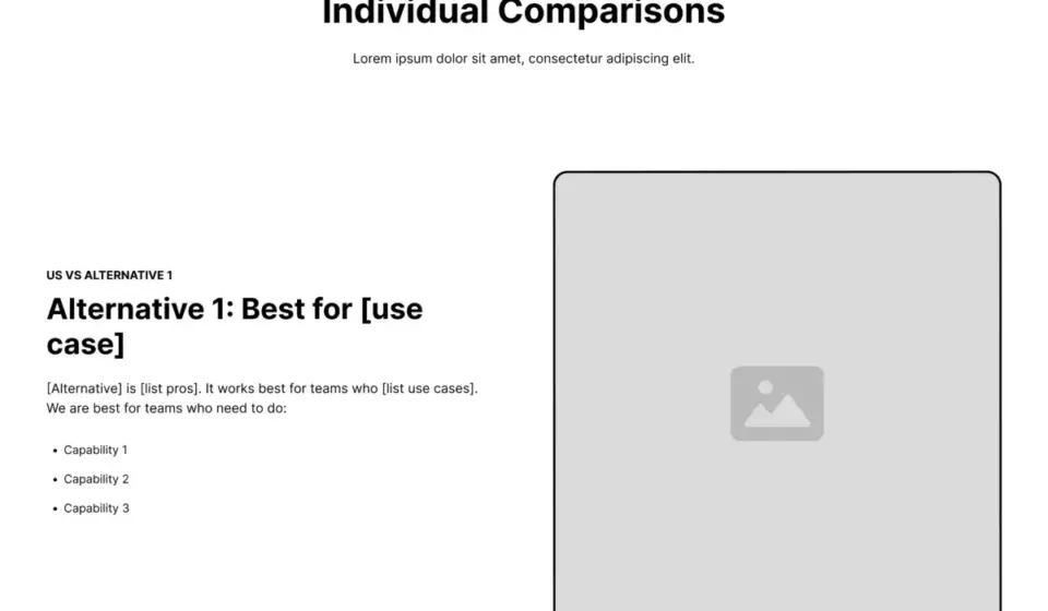
- One-to-One Competitor Comparison Pages: Tailored for buyers who have narrowed their shortlists and need a direct, side-by-side evaluation of two distinct options.
- Competitor Alternatives Pages: Built for high-intent switcher traffic—users who have outgrown a legacy tool due to pricing, inflexibility, or feature bloat and are actively seeking a reliable replacement.
The Fallacy of the Traditional Feature Table
A notable shift in modern landing page design is the intentional omission of the traditional feature matrix. Many top conversion rate optimization (CRO) experts advise leaving out standard check-and-X tables because they rarely capture the nuance of software functionality. A feature might technically exist in competitor software, but if it performs poorly, requires expensive add-ons, or breaks standard workflows, a simple checkmark is dangerously misleading. Instead, modern pages utilize qualitative breakdowns of core use cases, architectural differences, and target audience alignment.
Strategic Best Practices: Dos and Don’ts
Creating a trustworthy SaaS comparison page requires strict adherence to ethical copywriting and user-centric design principles.
The Dos
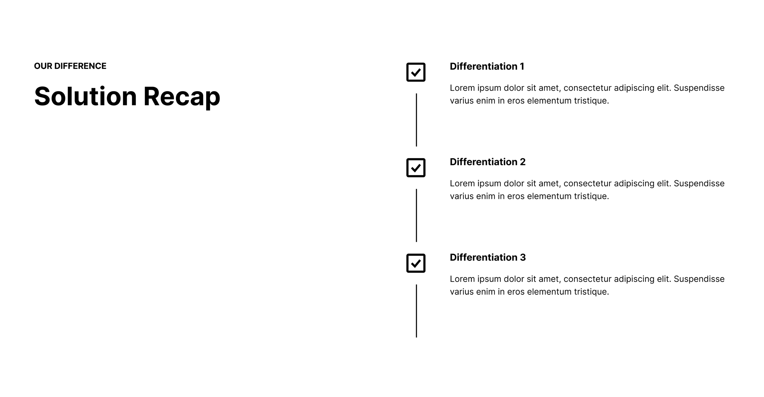
- Acknowledge trade-offs openly: Highlight where your product excels, but be equally transparent about where a competitor or alternative might be the superior choice for specific use cases.
- Ground claims in real data: Utilize customer interviews, third-party research, and verified case studies from users who successfully migrated.
- Align with search intent: Structure your headers, meta descriptions, and on-page navigation to directly address the specific questions and keywords your buyers are entering into search engines.
- Address migration friction: Dedicate space in your FAQs and content blocks to answer logistical questions regarding data migration, onboarding timelines, and learning curves.
The Don’ts
- Don’t talk down to competitors: Belittling alternative solutions erodes your brand’s credibility and signals insecurity to sophisticated buyers.
- Don’t write for everyone: Generic messaging aimed at pleasing every persona results in bland, unpersuasive copy that resonates with no one.
- Don’t create dead ends: Ensure your pages include intuitive navigation and helpful internal links that guide the user forward rather than trapping them in a conversion funnel.
Future Outlook
As artificial intelligence and conversational search engines continue to reshape how information is indexed and retrieved, the superficial marketing tactics of the past will become completely obsolete. LLMs and advanced search algorithms are increasingly adept at evaluating content quality, factual accuracy, and genuine user utility.
Pages that rely on deceptive positioning, thin content, and aggressive sales pitches will struggle to rank in organic search or gain visibility in AI-generated answers. Conversely, SaaS companies that invest in high-integrity, deeply informative comparison ecosystems will establish a distinct competitive advantage. By treating comparison pages as instruments of customer education rather than instruments of coercion, brands can build enduring trust, lower acquisition friction, and ultimately drive higher-quality, more sustainable conversions.