The Evolution of CSS Geometry: Mastering the border-shape Property and the Future of Web Layout

Executive Overview
For decades, Web Developers have bent over backwards, chained to the rigid tyranny of the rectangular box model. From elaborate multi-div clipping hacks and SVG data-URI background tricks to the modern constraints of clip-path and mask, crafting complex, organic shapes with native CSS borders, drop shadows, and interactive states has historically felt like navigating a minefield.
The web layout landscape is undergoing a monumental paradigm shift. Following the widespread Baseline adoption of the shape() function and the introduction of the versatile corner-shape property, the CSS Working Group has unlocked the final frontier of web geometry: border-shape.

Unlike clip-path, which ruthlessly shears an element—clipping away precious borders, outlines, and box-shadows alongside the background—border-shape fundamentally redefines how an element’s boundaries are rendered. By allowing native CSS decorations to gracefully hug, outline, or float across arbitrary paths, this upcoming property promises to render legacy layout hacks obsolete.
Though currently experimental and restricted to Chromium environments, border-shape—paired with the SVG-syntax-powered shape() function—stands poised to revolutionize UI design. This comprehensive investigative report explores the mechanics, use cases, architectural impacts, and future trajectory of CSS border shaping.

Detailed Chronology: The Journey to Dynamic Web Shapes
To understand why border-shape is such a monumental leap forward, we must trace the evolutionary path of shape rendering on the web.
Phase 1: The Box Model Era and Its Hacks
In the infancy of CSS, the web was unashamedly blocky. Every DOM element was an immutable rectangle. Creating non-rectangular UI elements required nesting multiple images, slicing transparent PNGs, or hacking the infamous transparent-border triangle trick:

.triangle
  width: 0;
  height: 0;
  border-left: 50px solid transparent;
  border-right: 50px solid transparent;
  border-bottom: 100px solid red;
While ingenious, these hacks offered zero flexibility for responsive fluid layouts, text integration, or dynamic user interaction.
Phase 2: SVG Overlays and the Advent of clip-path
As web design evolved toward asymmetric, organic layouts, developers turned heavily to Scalable Vector Graphics (SVGs) and the CSS clip-path property. While clip-path and the polygon(), circle(), and path() functions made it trivial to slice elements into stars, polygons, and custom blobs, they introduced an infuriating side effect: destructive clipping.

Because clip-path works by masking the rendered pixel output of an element, any decorative styles applied to the element—such as a border, an outline, or a box-shadow—are clipped right along with the background. If a developer wanted an outlined star shape with a red border, they could not simply apply border: 5px solid red;. Instead, they had to manually layer multiple DOM nodes, use complex SVG overlays, or resort to multi-layered CSS gradients.
Phase 3: The Modern Trifecta (shape(), corner-shape, and border-shape)
Recognizing these limitations, browser vendors and the CSS Working Group began drafting specifications to bridge the gap between vector graphics and CSS layout properties.

shape()Function: Introduced as a modern, human-readable alternative topath(), theshape()function allows developers to construct complex geometries using simplified SVG syntax directly insideclip-pathandoffset-path.corner-shapeProperty: Working in tandem withborder-radius, this property introduced keywords likeround,scoop,bevel,notch, andsquircle, giving developers granular control over element corners without requiring image assets.border-shapeProperty: The crowning achievement of this geometry wave.border-shapedivorces the concept of "clipping" from "shaping," allowing native CSS box decorations to map directly to custom paths.
Supporting Context & Metrics: How border-shape Operates
The genius of border-shape lies in its dual-mode syntax, standardized under CSS Borders Module Level 4. By accepting either one or two <basic-shape> arguments, the property fundamentally alters how the browser calculates paint boundaries.
1. Single Shape Mode (Stroke Mode)
When a developer passes a single basic shape (such as a polygon, circle, or the new shape() function) to border-shape, the browser enters Stroke Mode.

.shape
  border: 8px solid crimson;
  border-shape: shape(M 0 100 L 50 0 L 100 100 Z);
In this mode, the border is rendered as a clean, continuous stroke running precisely along the specified path. The stroke’s thickness is dictated by the element’s traditional computed border-width properties (border-width, border-color, etc.). This single-handedly eliminates decades of layout hacks, making true border-only geometric shapes a reality via a single line of CSS.
2. Two Shape Modes (Fill/Cutout Mode)
When developers provide two basic shapes to the border-shape property, the browser enters Fill Mode.

.shape
  border: 12px solid #333;
  border-shape: inset(0) circle(40px);
According to the specification:
- The first shape defines the outer boundary of the element’s decorated box.
- The second shape defines the inner boundary (the cutout).
The border (or background decoration) is rendered exclusively in the geographical delta between these two paths. By pairing an outer rectangle (inset(0)) with an inner custom shape (like a heart, a star, or a complex SVG path), developers can instantly produce complex cutout shapes where content or background fills are cleanly separated from the framing border.

The Death of border-radius Inheritance
It is worth noting a critical architectural nuance: border-shape completely overrides and ignores border-radius. Because the element’s entire geometric profile is governed by the border-shape path, traditional corner rounding becomes redundant. Developers looking for rounded corners within a shaped element must define those curves explicitly within their shape() or corner-shape rules.
Official Specifications and Industry Statements
Although implementations are currently confined to experimental Chromium flags, early reactions from the CSS design community have been overwhelmingly enthusiastic.

"Shaping corners is fantastic, but it remains fundamentally limited. What about shaping the entire element and letting its decorations follow suit? That is precisely what
border-shapeaccomplishes. Putting borders on CSS shapes is finally child’s play."
— Leandro Vernet, Frontend Architect & CSS Tooling Expert
Industry standard bodies emphasize that border-shape is not merely a visual gimmick; it represents a major optimization for web performance. Historically, achieving complex outlined shapes required embedding heavy inline SVGs or complex canvas elements. By moving path-based geometry into the CSS engine, browsers can optimize paint and composite layers natively, opening the door to smooth, hardware-accelerated UI animations.

Furthermore, design system maintainers have noted that border-shape drastically reduces DOM bloat. Buttons, badges, and card components that once required 4 to 5 nested HTML elements just to achieve custom angled or notched borders can now be rendered on a single semantic DOM node.
Future Outlook: Advanced Use Cases and Horizons
As browser vendors expand support for border-shape beyond experimental flags, the horizon of web typography, UI design, and interactive animation is set to expand dramatically. Here is a glimpse into what the future holds:

1. Breakout and Partial Decorations
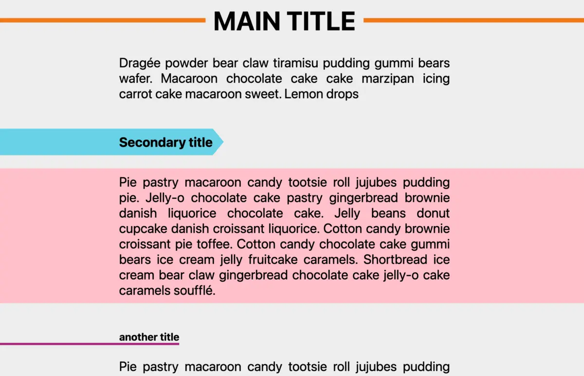
One of the most challenging layout patterns in modern web design is the "breakout" effect—where a text container remains constrained to a readable column width, but its background decoration or framing line stretches gracefully to the edge of the viewport.
By leveraging border-shape with negative offset values (such as inset(0 -100vw)), developers can orchestrate sweeping full-bleed background highlights and structural rules without breaking CSS Grid or Flexbox alignments.

2. High-Performance Shape Animations
Because border-shape is fully animatable using standard CSS transitions and keyframes, UI designers are no longer restricted to animating simple transform or opacity properties. We are moving toward an era of truly fluid interfaces:
- Hover-state morphing: Buttons that smoothly transition from rectangles into pill shapes, stars, or organic blobs on hover.
- Scroll-driven geometries: Elements that dynamically warp their border paths as the user scrolls down a page, driven by modern Scroll-driven Animations APIs.
- Squishy loaders: Organic, fluid SVG-style loading spinners rendered natively via CSS stroke animations.
.morph-button
  border: 4px solid var(--accent-color);
  border-shape: shape(M 0 0 L 100 0 L 100 100 L 0 100 Z);
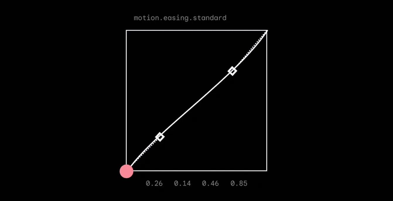
  transition: border-shape 0.5s cubic-bezier(0.4, 0, 0.2, 1);


.morph-button:hover
  border-shape: shape(M 20 0 L 80 0 L 100 100 L 0 100 Z);
3. Hand-Drawn and Organic UI Design
The era of hyper-minimalist, sterile corporate "flat design" is slowly giving way to organic, playful, and human-centric interfaces. With border-shape and the companion shape() converter tools widely available, developers can effortlessly implement hand-drawn underlines, electric frames, irregular card frames, and dynamic connecting lines that react in real-time to user drag-and-drop actions.

Conclusion
The introduction of the border-shape property marks the culmination of a decade-long crusade to liberate web developers from the confines of the rectangular box model. By bridging the gap between vector mathematics and traditional CSS box decorations—borders, outlines, and shadows—it eliminates the frustrating limitations of destructive clipping paths.
While browser support remains in its infancy, forward-thinking developers are already auditing their design systems and updating shape collections to prepare for the future. As Baseline adoption grows, border-shape will undoubtedly transition from an experimental playground feature into an indispensable staple of modern web development. The web is becoming infinitely more fluid—and our stylesheets are finally catching up.