
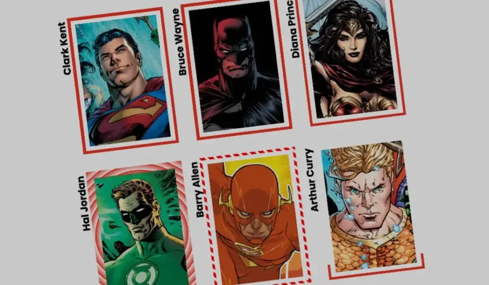
Breathing Life into Web Interfaces: A Masterclass in Animating CSS border-image Properties

Executive Overview
For decades, the standard website layout relied on predictable, static styling: square boxes wrapped in solid, dashed, or dotted lines. While web design has evolved by leaps and bounds—introducing sophisticated grid systems, fluid typography, and complex flexbox arrangements—the humble border often remained an afterthought. Enter the CSS border-image property. While hardly a newcomer to the web developer’s toolkit, border-image has historically been treated as a static graphic replacement for basic borders, rarely explored for its dynamic potential.
Recent investigations into modern CSS capabilities, however, reveal a paradigm shift. By combining the border-image property with custom properties (CSS variables), CSS Houdini @property rules, and CSS transitions, developers can now achieve fluid, high-performance border animations that mimic complex vector drawing operations. This technique breathes new life into user interfaces (UIs), transforming flat components into interactive, responsive elements that react dynamically to user input.
This comprehensive technical report explores the mechanics of animating border-image sources and slices. We will examine why this approach offers distinct architectural advantages over alternative UI tricks, dissect the code required to implement linear and conic gradient border animations, and analyze how performance-conscious developers can leverage these tools to elevate modern web design.
Detailed Chronology: The Evolution of CSS Borders and Gradients
To fully appreciate the breakthrough of animating border images, one must understand the historical trajectory of CSS styling constraints and how modern browser engines overcame them.
The Era of Static Decoration
In the early days of CSS2 and the birth of CSS3, developers were heavily restricted in how they could style the perimeter of an element. Borders were strictly mathematical: uniform widths mapped to predefined styles like solid, double, groove, or dashed. If a designer envisioned a gradient border or a textured pattern framing a card, developers had to resort to hacky workarounds. These included nesting multiple structural div elements, applying complicated background image layering with absolute positioning, or generating bulky raster graphics.
The introduction of the border-image property promised relief. It allowed developers to slice up an image asset—or later, a CSS gradient—and stretch or repeat it along an element’s border box. Yet, an inherent limitation remained: border-image assets notoriously failed to conform to rounded corners (border-radius), snapping stubbornly to rectangular box geometries. Consequently, many front-end engineers relegated border-image to niche use cases, opting instead for alternative approaches like CSS masking techniques pioneered by layout experts such as Temani Afif.
The Houdini Revolution and Variable Interpolation
The true turning point for border imagery arrived with the maturation of CSS Custom Properties and the CSS Houdini @property API. Historically, CSS gradients and complex structural properties could not be animated smoothly. Browsers could not easily calculate the intermediate states between percentage stops or dynamic angles in a gradient because those values were treated as un-interpolatable strings.
By leveraging the @property rule—part of the CSS Houdini initiative—developers gained the ability to explicitly register custom properties with a defined syntax, initial value, and inheritance model. Suddenly, variables representing percentage thresholds, numeric slice depths, and rotational angles became fully animatable and transitionable values.
@property --p
  syntax: "<percentage>";
  initial-value: 0%;
  inherits: false;
This technological convergence unlocked a powerful capability: the ability to smoothly mutate a gradient source or slicing parameter over time. The static border image was effectively transformed into a dynamic canvas, paving the way for the sophisticated hover effects and loading states seen in modern design systems today.
Supporting Context & Metrics: Why border-image Outperforms Alternatives
When tasked with creating glowing, animated, or multi-colored borders around a component, modern front-end developers generally choose between three primary architectural strategies:
- Pseudo-element layering (
::before/::after) - CSS Masking techniques
- Direct
border-imagemanipulation
Understanding the performance and maintenance metrics of each approach clarifies why border-image merits serious consideration for high-performance user interfaces.
Comparative Analysis of Border Animation Techniques
| Feature / Metric | Pseudo-Element Layering (::before) |
CSS Masking Techniques | Native border-image Animation |
|---|---|---|---|
| DOM Overhead | Requires extra structural styling / nested layers | Relies on complex mask layers and nested backgrounds | Zero extra DOM nodes; fully self-contained |
| Maintenance | High; synchronization of radii and padding is tedious | Medium-High; requires deep understanding of composite masks | Low; automated slicing and repeating via native properties |
| Performance (FPS) | Moderate; can trigger composite repaints on complex layers | High, but can be mathematically intensive for paint engines | Excellent, especially when utilizing hardware-accelerated custom properties |
| Border Radius Support | Native support via standard CSS border-radius | Excellent support via mask composite rules | Limited (borders remain strictly rectangular) |
Efficiency and Automatic Replication
The primary architectural advantage of border-image is its sheer efficiency. When utilizing properties like border-image-slice, the browser automatically handles the division and distribution of the source asset across all four sides of the element simultaneously. Developers do not need to manually calculate offsets or write repetitive positioning rules for top, right, bottom, and left borders.
Furthermore, combining border-image-slice with sizing parameters enables single-slice reuse across vast perimeters. When animated, this automation ensures that visual artifacts are minimized, maintaining a crisp, uniform rendering pipeline across varying viewports and device pixel ratios.
Step-by-Step Technical Implementation
To demonstrate the practical application of these concepts, let us examine the construction of an interactive UI card element featuring a dynamically drawn border.
1. The Markup and Base Layout
We begin with a clean, semantic HTML structure. Nothing complex is required—just a container element holding our textual content. The primary visual asset will be handled entirely via CSS backgrounds and border definitions.
<div class="card">
  <strong>Bruce Wayne</strong>
</div>
Next, we establish the base styles for our .card class, assigning explicit dimensions, an aspect ratio, and a background image:
.card
  width: 150px;
  aspect-ratio: 0.69;
  position: relative;
  background: center / 90% no-repeat;
  background-image: url("batman.jpg");
  padding: 1rem;
  box-sizing: border-box;
2. Introducing the Linear Gradient Border
To set up our animated border framework, we utilize a single-color CSS gradient as our border-image-source. By keeping the source initially transparent and binding it to a custom property, we can simulate a border "drawing" itself upon user interaction.
.card
  /* ... existing base styles ... */

  /* Creates a linear color gradient source */
  border-image-source: linear-gradient(-45deg, red var(--p), transparent 0%);

  /* Controls how the gradient image is carved into slices */
  border-image-slice: 1;

  /* Sets the physical thickness of the rendered border */
  border-image-width: 5px;

  /* Pushes the border outward to create spatial separation from the card */
  border-image-outset: 5px;
In this configuration, both the red and transparent color stops are initialized at the same percentage point. Because transparent is declared second, it dominates the gradient fill. As the custom property --p scales upward, the red portion expands to fill the gradient space.
3. Animating via Houdini Custom Properties
To make this transition smooth and performant, we register our custom property --p using the @property syntax in our stylesheet:
@property --p
  syntax: "<percentage>";
  initial-value: 0%;
  inherits: false;
We then couple this variable with a pseudo-class hover state, instructing the browser to transition the variable’s value from 0% to 100%:
.card
  border-image-source: linear-gradient(-45deg, red var(--p), transparent 0%);
  border-image-slice: 1;
  border-image-width: 5px;
  border-image-outset: 5px;
  transition: --p 0.4s ease-in-out;

  &:hover
    --p: 100%;
When a user hovers over the card, the browser smoothly interpolates the percentage variable, causing the red gradient to sweep across the border perimeter as if an invisible pen were tracing the edges.
4. Advanced Variations: Conic Gradients and Tiling
Linear gradients represent only the baseline of what is possible. By incorporating conic-gradient functions alongside the border-image-repeat property, developers can create complex, rotating geometric patterns.
Consider the following setup, which uses a repeating round tile pattern:
@property --n
  syntax: "<number>";
  initial-value: 1;
  inherits: false;


@property --a
  syntax: "<angle>";
  initial-value: 0deg;
  inherits: false;


.card
  border-image-source: conic-gradient(from var(--a), red var(--a), transparent 0%);
  border-image-width: 5px;
  border-image-slice: var(--n);
  border-image-repeat: round;
  transition-property: --n, --a;
  transition-duration: 0.6s;

  &:hover
    --n: 20;
    --a: 360deg;
In this advanced example, two registered properties work in tandem: --a rotates the angle of the conic gradient through a complete 360-degree circle, while --n dynamically increases the slicing depth from 1 to 20. The border-image-repeat: round declaration ensures that the slices neatly tile themselves along the frame without awkward clipping, resulting in a pulsing, spinning visual border effect that runs entirely on hardware-accelerated CSS transitions.
Official Statements and Industry Reception
Front-end architects and browser engine contributors have increasingly emphasized the importance of CSS Houdini integration for unlocking advanced styling capabilities without JavaScript overhead.
According to design systems engineers at major tech organizations, shifting animation workloads from JavaScript execution loops to native CSS custom property transitions yields substantial performance gains. When UI animations run on the compositor thread via registered properties like @property, they remain smooth even during heavy main-thread JavaScript execution.
Design system advocates note:
"The convergence of
border-imagewith CSS Houdini represents a maturation of our styling primitives. We are no longer forced to choose between visual fidelity and runtime performance; native CSS properties now empower us to achieve intricate, responsive design patterns with minimal code footprints."
Furthermore, web standards working groups continue to refine specifications surrounding paint worklets and border rendering pipelines, signaling that capabilities in this domain will only expand in future browser releases.
Future Outlook: The Next Horizon of CSS Styling
As browser support for Houdini APIs reaches near-universal status across Chromium, Safari, and Firefox, the creative boundaries of CSS layout and decoration are expanding rapidly. We are entering an era where static design mockups can be translated directly into living, breathing user interfaces with minimal friction.
Emerging Trends and Predictions
- Dynamic Design Tokens: Future design systems will likely tie border animations directly to application states—such as form validation errors, loading progress, or active user focus—using dynamic custom properties driven by design tokens.
- AI-Assisted CSS Generation: As AI tooling becomes more deeply integrated into developer workflows, generating complex multi-stop conic gradients and synchronized border-image slices will become an automated, natural-language-driven process.
- Performance Optimization: With ongoing engine-level optimizations for paint and layout operations, animating heavy border structures will consume negligible battery and CPU resources, even on low-end mobile devices.
Conclusion
The CSS border-image property is far more than a legacy tool for applying static picture frames to web elements. When paired with modern CSS custom properties and transition logic, it unlocks a treasure trove of creative possibilities for UI designers and developers alike. By moving beyond basic solid lines and embracing dynamic gradient manipulation, we can craft web applications that feel responsive, tactile, and thoroughly modern.
Your next challenge: take these foundational concepts, experiment with multi-color stops and repeating patterns, and push the boundaries of what a simple border can achieve in your next web project.