
Mastering the Native HTML <dialog> Element: Architecture, Accessibility, and Advanced Styling

Executive Overview
Nearly a decade after its introduction to the web ecosystem, the native HTML <dialog> element remains one of the most powerful yet nuanced building blocks in modern web architecture. While developers often reach for third-party JavaScript libraries or heavy UI frameworks to handle pop-ups, alerts, and complex workflows, the browser’s built-in dialog element offers a robust, standards-compliant alternative.
However, beneath its seemingly straightforward syntax lies a web of architectural intricacies. Mastering the native <dialog> requires a deep understanding of browser user-agent (UA) styles, modal versus non-modal states, automatic focus management, accessibility best practices, and the modern layout rules that govern the top layer. Furthermore, recent evolutions in CSS—such as the :open pseudo-class, the @starting-style at-rule, overscroll containment, and upcoming declarative features like invoker commands—have fundamentally transformed how front-end engineers interact with dialogs.
This comprehensive guide explores the structural anatomy of the HTML <dialog>, compares it directly with the Popover API, investigates accessibility traps, and provides advanced styling strategies to ensure your modals are performant, accessible, and visually stunning.
Detailed Chronology & Core Architecture
1. Basic Markup and Initialization
At its core, implementing a native dialog begins with standard semantic markup. The element remains hidden by default, reflecting the absence of the open attribute.
<button id="dialog-button">Open Dialog</button>
<dialog id="dialog">
  <p>This is a native HTML dialog.</p>
</dialog>
While developers can manually toggle visibility by injecting the open attribute directly into the HTML (<dialog open>), this is rarely ideal for dynamic user interfaces. Instead, interaction is typically driven via JavaScript.
2. show() vs. showModal(): Understanding the Top Layer
Invoking a dialog requires choosing between two distinct JavaScript methods, each yielding radically different runtime behaviors:

dialog.show(): Opens the dialog as a non-modal popup. It does not generate a backdrop, does not automatically center the element within the viewport, and fails to engage theinertstate on background content. It behaves similarly to a custom tooltip or dropdown menu.dialog.showModal(): Promotes the element to the browser’s top layer, rendering it above all other document content. It automatically calculates viewport centering, generates a reactive::backdroppseudo-element, traps keyboard focus within its subtree, and listens for theEsckey to trigger closure.
const dialogButton = document.querySelector('#dialog-button');
const formDialog = document.querySelector('#dialog');

dialogButton.addEventListener('click', () =>
  formDialog.showModal(); // Elevates to a true modal experience
);
3. Closure Mechanics and Declarative Workflows
Closing a modal can be handled programmatically via the .close() method or declaratively through HTML semantics.
const formClose = document.querySelector('#dialog-close');

formClose.addEventListener('click', () =>
  formDialog.close();
);
For developers seeking a JavaScript-less approach, the HTML specification allows a form nested within a dialog to act as a native closer when configured with method="dialog":
<dialog id="dialog">
  <form method="dialog">
    <p>Are you sure you want to proceed?</p>
    <button type="submit">Close Dialog</button>
  </form>
</dialog>
4. The Horizon of Invoker Commands
As the web platform evolves toward declarative architectures, the introduction of invoker commands aims to eliminate boilerplate JavaScript for opening and closing dialogs and popovers. Though experimental in certain engines, this paradigm allows developers to wire triggers directly inside markup using the command and commandfor attributes:
<button command="show-modal" commandfor="my-dialog">Show Dialog</button>

<dialog id="my-dialog">
  <p>Controlled entirely via declarative HTML attributes.</p>
  <button command="close" commandfor="my-dialog">Close Dialog</button>
</dialog>
Engineers can still listen to these actions programmatically via event listeners on the dialog element:
const dialogs = document.querySelectorAll("dialog");

dialogs.forEach(dialog =>
  dialog.addEventListener("command", event =>
    if (event.command == "show-modal")
      // Custom tracking or analytics on modal open
     else if (event.command == "close")
      // Custom tracking on modal close

  );
);
Supporting Context, Metrics & Accessibility
Building production-ready dialogs demands careful attention to accessibility (a11y) and user experience patterns. Native dialogs handle heavy lifting—such as trapping focus and applying inert to background elements—but implementation details can easily break assistive technologies if mismanaged.
Button Labeling and Screen Readers
A common antipattern involves labeling close buttons with a minimalist "X" or an unlabelled SVG icon. While visually concise, screen readers will fail to interpret the intent correctly.

<!-- Sub-optimal for accessibility -->
<button id="dialog-close">X</button>
To maintain an accessible experience while keeping a modern visual design, utilize a visually hidden span alongside an aria-hidden decorative icon:
<button id="dialog-close">
<span class="visually-hidden">Close modal</span>
<span aria-hidden="true">×</span>
</button>Focus Management upon Open
When a modal dialog opens, the browser automatically shifts focus to the first focusable element inside the dialog. In many cases, this is the close button. While functional, this can lead to accidental closures if a user rapidly hits the Space key right as the dialog renders.
If the dialog contains more complex interactive elements—such as form text fields or primary call-to-action links—consider explicitly managing initial focus using the tabindex attribute to direct user attention where it adds the highest value.
Innate Inertness and DOM Interactivity
When a modal dialog is active via showModal(), the underlying document tree automatically becomes inert. This means background text selection, background link clicking, and background form inputs are entirely disabled without requiring manual developer intervention.
However, this protection only applies to true modals. Non-modal popups initialized via show() do not trigger inert subtrees, meaning background elements remain fully active and interactive.
Official Statements & Advanced Styling Strategies
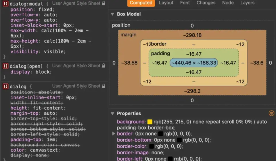
User-agent stylesheets for the <dialog> element provide a functional baseline (white background, standard padding, and a prominent black border), but custom designs require navigating specific CSS specificity rules.

Targeting the Open State
Developers frequently encounter styling bugs when trying to select the dialog directly. Custom styles should target the dialog explicitly in its active state using the [open] attribute or the :open and :modal pseudo-classes:
dialog
  /* Default closed state overrides if necessary */

  &[open]
    background-color: var(--dialog-bg, #ffffff);
    border: none;
    border-radius: 16px;
    box-shadow: 0 25px 50px -12px rgba(0, 0, 0, 0.25);
Managing Viewport Scroll and Overscroll Behavior
A classic issue with modal overlays is background scrolling. When a long page has an open dialog, scrolling the viewport can disorient the user. Historically, developers resolved this by toggling overflow: hidden on the <body> element via JavaScript:
body:has(dialog[open])
  overflow: hidden;
Modern browser engines offer a more declarative solution via overscroll-behavior. By making the dialog a scroll container and applying containment rules to both the dialog and its backdrop, background scroll chaining can be successfully eliminated:
dialog
  overflow: hidden;
  overscroll-behavior: contain;

  &::backdrop
    overscroll-behavior: contain;
Crafting Sophisticated Backdrops
The default UA backdrop features a subtle, semi-transparent dark tint. Using the ::backdrop pseudo-element, engineers can completely transform the atmosphere of the application overlay:
dialog::backdrop
  background-color: rgba(15, 23, 42, 0.6);
  backdrop-filter: blur(8px);
  transition: backdrop-filter 0.3s ease;
Animating Entries and Exits with @starting-style
Because dialogs transition from display: none to an active layout state, standard CSS transitions (transition: opacity 0.3s ease) fail out of the box. The browser has no initial opacity value to transition from when the element is not yet rendered in the DOM.
The introduction of the @starting-style at-rule solves this architectural limitation by defining the initial state of an element right as it enters the rendering tree:

@starting-style
  dialog:open
    opacity: 0;
    transform: translateY(20px);


dialog
  opacity: 0;
  transform: translateY(20px);
  transition: opacity 0.4s cubic-bezier(0.16, 1, 0.3, 1),
              transform 0.4s cubic-bezier(0.16, 1, 0.3, 1),
              overlay 0.4s cubic-bezier(0.16, 1, 0.3, 1) allow-discrete;

  &[open]
    opacity: 1;
    transform: translateY(0);
Future Outlook: Dialog vs. Popover API
As developers design complex web applications, a recurring architectural question arises: Should I use the native <dialog> element or the Popover API?
While both features leverage the browser’s top layer, they serve fundamentally different design patterns:
- Accessibility & Focus Management: The
<dialog>element (specifically when modal) provides built-in accessibility affordances, including automated focus trapping,Esckey listeners, and background inertness. The Popover API is intentionally lightweight; it does not trap focus or automatically make background content inert, requiring developers to handle these accessibility requirements manually via JavaScript. - Semantic Intent: Dialogs are designed for blocking interactions that require explicit user response (e.g., confirmation prompts, settings forms, critical alerts). Popovers are designed for non-blocking contextual UI components (e.g., dropdown menus, tooltips, floating panels) where users can easily interact with surrounding page content without closing the popover.
- Semantic Roles: Popovers require explicit, developer-defined ARIA roles to communicate their purpose to assistive technologies correctly, whereas dialogs carry clear native semantics out of the box.
Strategic Summary Recommendation
| Feature Requirement | Recommended API |
|---|---|
| Critical user action requiring explicit confirmation | Native <dialog> (showModal()) |
| Non-blocking floating context or contextual menu | Popover API (popover) |
| Automatic background inertness & focus trapping | Native <dialog> (showModal()) |
| Lightweight UI layer without focus locking | Popover API (popover) |
Selecting the correct primitive ensures long-term application maintainability, robust performance, and an uncompromised experience for users relying on assistive technologies. As declarative patterns like invoker commands mature and browser support for advanced CSS layout properties standardizes, the native HTML dialog remains the undisputed gold standard for modal architecture on the modern web.