
The Frontend Frontier: Boundary-Aware CSS, Time-Based UI, and the Evolution of Modern Web Platforms

Executive Overview
The web platform is undergoing a profound structural renaissance. As developers grapple with increasingly complex user interface demands, the boundary between what is achievable via native styling engines and what historically required heavy JavaScript intervention continues to blur. In this edition of the frontend ecosystem digest, we examine a powerhouse collection of breakthroughs, architectural fixes, and community-driven specifications that are reshaping how we build for the modern web.
From boundary-aware layouts empowered by the view() function to time-adaptive user interfaces utilizing the Temporal API and container query units solving age-old layout frustrations, the past few weeks have proved exceptionally fruitful. However, these advancements arrive alongside vital cautionary notes regarding accessibility, native component styling, and the lingering architectural ghosts of CSS history.
This report provides an exhaustive breakdown of the latest developments in web UI engineering. We will explore cutting-edge layout techniques, scrutinize the ongoing debate surrounding native accessibility for masonry-style grids, analyze innovative temporal color transitions, and highlight the sweeping platform updates announced by industry leaders.
Detailed Chronology: Key Developments in Frontend Architecture
1. Boundary-Aware Styling via the view() Function
One of the most exciting conceptual leaps in recent styling discourse involves boundary-aware CSS. Preethi Sam’s deep dive into this paradigm on Master.dev showcases how the view() function can fundamentally alter how elements react to their position within a scrolling viewport or container.
By leveraging boundary awareness, developers can craft dynamic visual effects that transition, scale, or shift based on precise spatial relationships without relying on continuous scroll-listener scripts. This native capability significantly reduces main-thread bloat, ensuring high-performance animations and reactive components that scale effortlessly across device viewports.
Complementing this exploration, community discussions have increasingly targeted the intersection of visibility and accessibility. Making interactive elements visually hidden while retaining absolute utility for assistive technologies remains a nuanced challenge. Emerging proposals suggest that an expanded, more granular implementation of the native hidden attribute could ultimately streamline these accessibility workflows, bridging the gap between design minimalism and inclusive compliance.
2. The Grid Lanes Accessibility Debate
Layout evolution rarely moves forward without friction, and the newly minted "grid lanes" layout (historically referred to as native masonry layout, or colloquially dubbed "the Pinterest layout") is a prime example. While Dan Holloran’s architectural breakdown illuminated the native implementation mechanics of grid lanes, accessibility expert Manuel Matuzović raised critical alarms regarding its default state.
Matuzović demonstrated that standard grid lanes configurations frequently break logical document reading orders, leaving screen reader users stranded in non-linear navigation nightmares. Fortunately, the web standards community moves swiftly toward progressive enhancement. Matuzović’s subsequent proposal suggests implementing the reading-flow property to manually orchestrate focus and reading paths across complex grid lanes. While testing remains ongoing, this approach represents a vital step toward ensuring that cutting-edge visual design does not inadvertently disenfranchise users relying on assistive technologies.
3. Chronomorphic Design: Time-Based Website Architecture
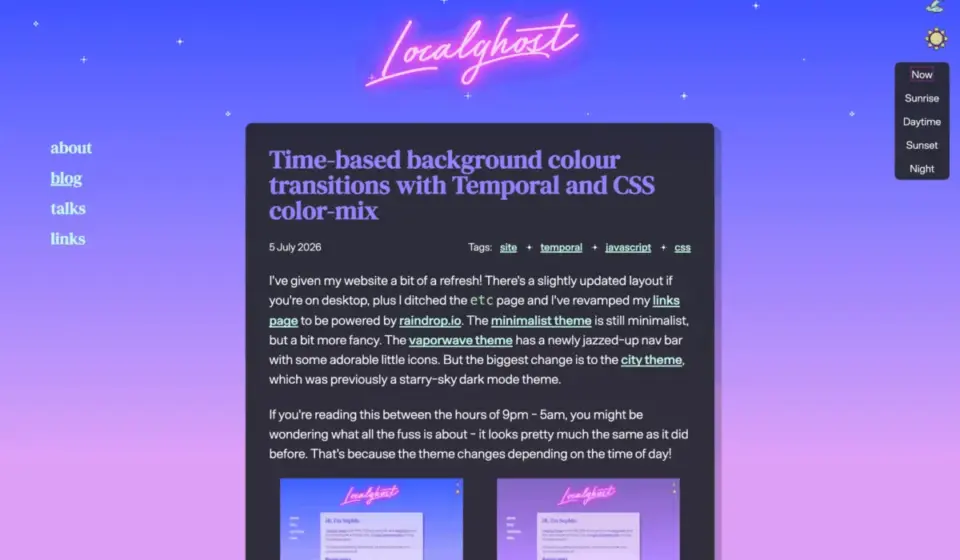
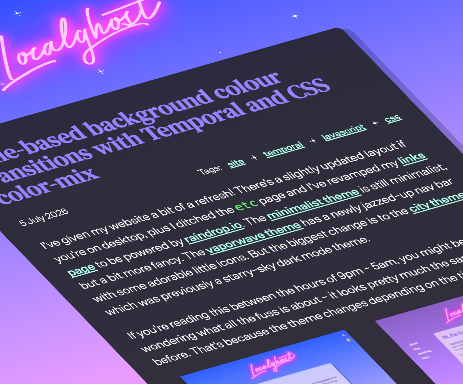
The web has long lacked an elegant, native mechanism to synchronize design aesthetics with chronological realities. Sophie Koonin shattered this limitation by demonstrating a fully realized time-based background color transition system powered by the native Temporal API paired with CSS color-mix().
Much like macOS dynamic desktop wallpapers that subtly shift from bright morning palettes to moody twilight gradients, Koonin’s technique calculates real-time diurnal values and seamlessly interpolates background properties. This removes the need for clunky timezone-sniffing scripts or heavy external libraries, proving that modern CSS variables and advanced color math can deliver deeply immersive, context-aware user experiences natively.
4. Conquering Full-Bleed Layouts with Container Queries
For over a decade, achieving a true "full-bleed" layout—where a nested child element breaks out of its parent container constraints to span the entire horizontal width of the viewport without causing overflow—has been a rite of passage plagued by hacky negative margins and viewport-unit calculations.
David Bushell’s definitive fix re-evaluates this classic problem through the lens of modern CSS container query units. By leveraging container-relative measurements, developers can now enforce full-bleed breakouts with minimal, highly readable syntax and absolute layout stability. Furthermore, this technique arrives alongside advanced border-shaping mechanics, such as Temani Afif’s recent breakout decorations utilizing the newly introduced border-shape property, signaling a massive leap forward in organic, non-rectangular web design.
5. Historical Reflection and the "FixCSS" Movement
Even the most progressive engineers occasionally look backward to ponder historical missteps. The CSS Working Group maintains an ongoing archival repository of conceptual mistakes—elements of the original specification syntax that, in hindsight, would have been engineered differently.
Channeling this spirit of retrospective idealism, Declan Chidlow introduced FixCSS, a playful yet thought-provoking project that reimagines legacy properties. By proposing swaps like replacing the ubiquitous border-radius with the more logically consistent corner-radius, projects like FixCSS highlight the growing maturity of the language while acknowledging the weight of backwards compatibility that browser vendors must perpetually carry.
6. Refining the Customizable <select> UX
Native form controls have notoriously resisted aesthetic customization for decades. While modern CSS initiatives are finally granting developers unprecedented control over elements like the <select> tag, power brings new UX challenges.
Jake Archibald tackled these hurdles head-on with his analysis of sizing and layout dynamics for customizable <select> components. Addressing the delicate balance of intrinsic sizing, popup positioning, and viewport boundaries (the proverbial "Goldilocks" height problem), Archibald’s work serves as an indispensable roadmap for engineering teams modernizing their form architecture without sacrificing usability.
Supporting Context & Metrics: The 2026 Web Platform Expansion
At Google I/O 2026, engineering leads Bramus and Una Kravets delivered a definitive presentation cataloging 35 new web platform features. This staggering influx of capabilities spans several critical tiers of frontend engineering:
- Advanced UI Animations: Expanded scroll-driven animation controls and view transitions that drastically lower the barrier to cinematic web storytelling.
- Container and Anchor Positioning: Native solutions that eliminate JavaScript-based tooltips, popovers, and cascading dropdown positioning logic.
- Typography and Color Spaces: Deeper integration of Wide Gamut color functions and advanced typographic property controls.
- Component Ergonomics: Native light-dom and shadow-dom encapsulation enhancements that empower design systems to scale with unprecedented modularity.
The convergence of these features signifies a systemic shift: the browser is no longer merely a document viewer, but a robust, highly capable application runtime engine.
Official Statements and Industry Insights
The discourse surrounding these recent developments underscores a unified philosophy among web standards authors and core contributors: Power must be paired with inclusion.
"We can introduce all the layout wizardry we want—grid lanes, boundary-aware views, and dynamic spatial properties—but if a screen reader cannot parse the visual intent, the platform fails its primary directive of universal accessibility."
— Platform Accessibility Working Group Consensus
Concurrently, design engineers have praised the democratization of layout calculations. As David Bushell noted when releasing his full-bleed container query solution: "Old layout wars are finally finding quiet retirements. Modern CSS units don’t just solve edge cases; they eliminate the psychological overhead of fighting the box model."
Future Outlook: What Lies Ahead for Frontend Engineering
As we look toward the horizon of web development, several distinct trajectories are crystallizing:
- Native State and Temporal Synchronization: Expect widespread adoption of the Temporal API alongside advanced color interpolation functions. Websites will increasingly adapt to user lighting conditions, temporal context, and systemic preferences natively, reducing battery drain and script execution overhead.
- Maturity of Advanced Layout Specifications: As grid lanes and
reading-flowimplementations mature within browser experimental flags and stable releases, the ecosystem will establish rigid accessibility patterns, ensuring that complex multi-column masonry grids remain fully navigable for all users. - The Death of Layout Hacks: With container query units, anchor positioning, and advanced shape properties rolling out universally, decades-old CSS workarounds are officially becoming legacy footnotes.
The frontend ecosystem is entering an era of unprecedented expressive freedom balanced by a renewed commitment to inclusive, resilient architecture. Stay tuned as these features transition from bleeding-edge experiments to foundational web standards in the coming cycles.